Praxis: 360° Navigation Interaction Design
Re-imagining a easy-to-use, user-friendly navigation system for an immersive learning experience
Client
Praxis Labs
Duration
April, 2022
Roles
UX & Interaction Designer, Prototyper
Tools
Figma, Unity
Collaborators
Jessica Stewart, Tianxu Zhou
Overview
Praxis Labs is a 360° immersive learning platform for corporate diversity, equity, and inclusion (DEI) training. It leverages immersive technology and research-backed curriculum to help learners build empathy, gain awareness, and knowledge, and apply these learnings in their workplace.
I led the revamp of the navigation design to enhance ease of use and ensure an enjoyable and immersive experience. As the sole designer on the project, I oversaw the end-to-end design process, from UX and Interaction Design in Figma, implementing UI elements in Unity, to creating animations.
The Problem
Users found the current navigation interaction confusing, difficult to use and could even cause nausea. As a result, there was a significant drop off rate at the beginning of the experience.
Goals
Ensure first-time users can quickly grasp the mechanism of the navigation. This includes introducing an easy-to-use interaction and intuitive onboarding process that minimizes the learning curve.
Prompt returning users to recall the navigation effortlessly. This entails designing an intuitive interface that swiftly reminds users of the navigation when they return to the experience.
User Research
Our analytics review and user interviews with existing clients discovered that the current navigation posed a learning barrier for users to smoothly go through our experience. Known as "mouse-look," the current navigation works by allowing users to move the mouse cursor to change their field of view, mimicking a first-person perspective. While mouse-look is a common control scheme used in a lot of immersive experiences such as first-person shooter (FPS) video games, it fails to provide the most user-friendly experience for Praxis's diverse audience, not all of whom are seasoned gamers. Users have expressed confusion when they seemingly lost control of the mouse upon entering the web-based application when their cursor was replaced with a reticle. Furthermore, several users reported experiencing nausea in some instances. Despite Praxis's earlier efforts to address the issue with a tutorial, the results were less than ideal.
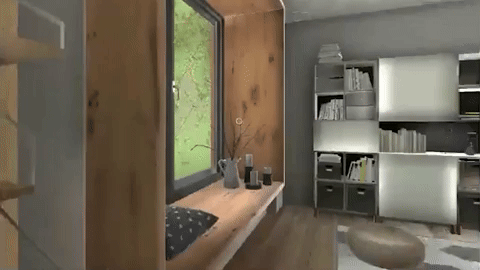
The former mouse-look navigation with a central reticle cursor
INTERVIEWI conducted 5 user interviews with existing clients to hear their thoughts on the current mouse-look feature. This is what they said:
“It took me a while to notice a tiny dot in the center of the screen, which I later realized was meant for navigation.”
“It was a bit disorienting, especially when I paused the experience. Upon returning, I struggled to locate the cursor again.”
“The mouse is so sensitive that even a slight movement sends the viewport all the way to the ceiling. It can be nauseating.”
Design
IDEATION & PROTOTYPING Research references of common interaction inputs triggered by mouse and keyboard
Considering users would need a laptop for the training, I explored three potential interactions that use either keyboard or mouse as input: typing on keyboard, dragging and panning, and mouse scrolling.
We prototyped the three interactions and quickly tested it with users. User testing show that "panning and dragging" navigation is the most user-friendly approach among the three. This control scheme allows users to click and drag the map to move it in different directions, exploring various areas of the map without changing the zoom level. It permits fluid and continuous motion, as users can move content in any direction, including horizontal and vertical scrolling, making it an ideal choice for viewing and navigating Praxis’ expansive, detailed virtual environment.
FLOWCHARTI designed the navigation instruction to be part of the onboarding process, which shows up briefly every time when users start a new course. It’s repeatable if a user has forgotten upon return.
I experimented with several design iterations and, in collaboration with the product manager, conducted testing with 10 users. In general, the feedback provided strong confirmation that panning and dragging was the right direction to pursue. Not only did I develop a clear user flow, but the new design also notably reduced feelings of nausea. Below, you can view the finalized design.
Final Design

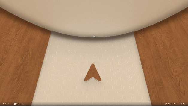
The highlight tells users to left click and the arrows tell movement directions

The animation tells users they can move the mouse in four directions: up, down, left, and right
The positive results from user testing have reinforced our confidence in the chosen navigation system, and we are excited to implement it as part of our ongoing efforts to enhance the user experience within Praxis Labs. I believe that this change will make the platform more accessible and enjoyable for all of our users, aligning with our mission to provide effective and immersive diversity, equity, and inclusion training.
To fully mimic human’s head movement, I also designed the range of the cursor movement to be capped at around 180 degrees on both the X and Y axis. Even though the experience is technically housed in a 360-degrees virtual space, studies have shown that in reality, the area of interest for users is right in front of them and diminishes as the experience requires more head movement.
Capping the cursor movement at around 180 degrees
I also designed three states of the mouse cursor - idle, drag and pan, point - to differentiate the interactions.

Idle

Grab and pan

Point
Reflections

Potential visual design for the next iteration
Some users mentioned the visual design could benefit from the addition of up and down arrows, making it more explicit for users that they can navigate the space in all directions (see image below).
Another feature to consider is providing an alternative to panning-and-dragging for a more comprehensive and user-friendly experience that addresses the limitations of mouse-controlled movement. Arrow key movement would be a nice alternative.
Giving users the opportunity to customize their cursor sensitivity can further reduce the chance of motion sickness.